Understanding Projector Images and Screen size from Distance
Seeing a projector screen and projector at an event is considered pretty standard nowadays. What size is best and is there a standard ratio?
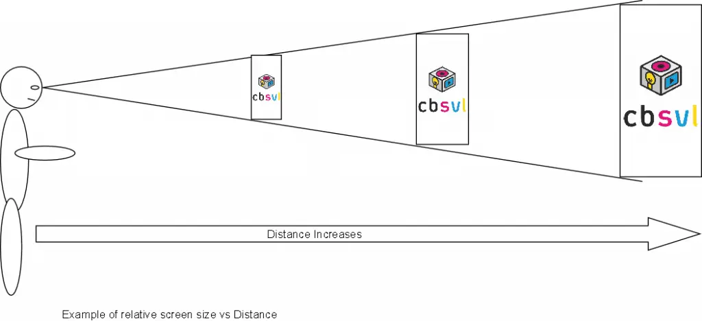
When selecting the size of a screen we get many enquires for 50″ TV’s or nearabouts. Often asked this because it’s a bit bigger than the screen at home and people often think it’ll be big enough. Swap out the size of a typical training room or conference room at 10 -30 meters deep for your average front room at 3m, it doesn’t leave much to the imagination on how small the tv will now look! Below is an example of the human eye v’s distance and how the screen size needs to increase with distance to maintain the same relative size.
Screen size vs distance

If you consider the above example, the first screen may be your home TV, quite close and small. As you increase the distance for example because of more people in the room to be able to see the screen clearly still you need to increase the screen size. The screen to the very right most may be some 20m away from the audience and may be as wide as 4m.
Screen Ratios
A presentation can be made into any shape to fit different screen canvas’ or banners for advertising. In presentations however there are a few common sizes, we would never say “standard” size as really there isn’t one!
There are many reasons for this, there may be limitations of the fixed projection and screens at a venue, or it maybe a company brand to only use X size format projector screen. It’s very frustrating when we’re told “it’s the standard format”.
As you see below there are several known relatively common place formats which have been adopted over the years mainly from television and Computer screens.

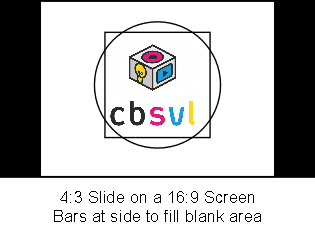
It wouldn’t be the first time we’ve agreed on a size ratio screen like the above examples, and when the presentation turns up, it’s a different format. Below is an example of the two common errors. The first is a 4:3 powerpoint or keynote presentation as seen on a 16:9 screen, sometimes if the slides have white backgrounds or black backgrounds then it isn’t too much of an issue apart from dead areas either side. If your slides have colour backgrounds then be prepared for white or black or a preset colour bars either side.
The above is the preferred way to handle to error situation, many modern softwares will allow you to reformat the slide ratio without affecting the content and can be a little trick to pull it out the bag and make a success!
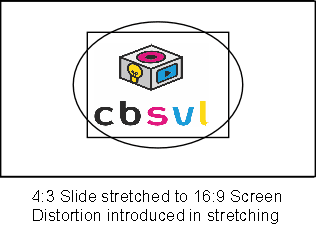
The other option we occasionally see being done and will make any true projectionists tremor at the knees is to stretch the image to fit the screen. Even the difference between a 16:9 / 16:10 doesn’t look major but for rounded or square content logos etc the distortion is quite harsh.
Our top tip is to fully understand the screen requirement and presentation requirement fully before committing. It doesn’t hurt to ask!


Comfort & Relay Monitors
Unless you’re on stage you rarely see a comfort monitor. As an audience member it’s not really for your benefit. Standing on stage you want to be addressing the audience, looking at them, engaging them. You don’t want to be looking back at the screen every slide to remember where you are, or read parts.
Comfort monitors are typically installed in front of the stage or on a lectern and can provide a mimic of the main screen. We say this because really you can have anything on them, we have supplied previous and next slide screens before now, you can split them to display presenter notes, and you can even put timers on them to show the presenter how much longer they have. The possibility of what you can put on them as a feedback to the presenter on stage is endless providing a seamless information update. Below are some simple examples of comfort monitors.

